Tuesday, March 30, 2010

Final Project Precedents

Tadao Ando’s Maritime MuseumThis design is incredibly beautiful, but sadly was never built. Here Ando designs carefully and deliberately with light, considering how it interacts with the form of his building and with the water passing through the building. The rendering is especially revealing, showcasing light’s smooth gradation across the building itself, the reflections of the light on the water, and the shadows cast on the water by the building form. By keeping the form and materials simple, Ando is able to highlight the behavior of light where it otherwise may be overwhelmed by shapes and colors competing for our attention. While I don’t intend to use water in my design, I would like to design my installation in a way that’s as considerate to and interactive with the environment as much as Ando’s design is to his.

More information on the museum's design can be found here: http://desmena.com/?p=68


Kumi Yamashita’s Shadow ArtA link to Kumi Yamashita’s site: http://kumiyamashita.com/

Yamashita creates extraordinary and detailed shadows from ordinary objects. To do this, Kumi has to have a strong working knowledge of the exactly type of light source and its location, the location of every individual object, and the location and material of the screen onto which the shadows are projected. The alterations to the shadow-caster often seem subtle at first, but can create drastic shadow effects.

(untitled work) from Prisoner’s Creative Arts Project
I picked up this drawing from the Prisoner’s Creative Arts Project last year. Unfortunately I was not given the tag with the piece’s title, or the artist’s name, so that information has sadly been lost. Through only a small range of colors, this drawing demonstrates every possible way that light can interact with clouds: shining through them, backlighting them, front lighting them, making them cast shadows, making them glow. The source remains constant, but the position, density, and thickness of the clouds are all different, and thus cause the light to interact differently with them. This work shows how by keeping some parts simple – the color scheme, only using clouds, etc – a wide variety of light interactions can be the entire focus of a piece.

Sunlight Filtered Through Leaves
Canopies of leaves on a sunny day are a direct inspiration for this last project. I have always found it beautiful when the sun lights leaves from behind, rendering them semi-transparent so you can see the veins of the leaf and silhouettes of the leaves and branches behind it. I would like to capture this effect somehow, using sunlight to create some level of transparency in a material, but also capturing the shadows of the leaves and branches above it.

Scott Clark Photography
First, a link to Scott Clark’s photography website: http://scottfoto.blogspot.com/

From what I have seen, Scott Clark does not always make light the focus of his photography (though at times he certainly does) but I feel like the viewer is always made aware of the light conditions nonetheless. The lighting seems to always be deliberate, or well taken into account… the shadows of subjects are framed as carefully as the subjects themselves. In every case I can see, the lighting is natural, be in sunlight or firelight, and the colors are all very vibrant. I would like to be able to create a similar awareness of light and shadow, though perhaps more directly in my project.

Update!!!!! New Improvement on my Idea!!

So I was thinking about how the heck I was going to do my project, and got extremely overwhelmed with all of the technical difficulties that I would encounter on my way, and all of the technicalities that I would have to face. I am no good at that stuff, so I started to think of another way to achieve me goal. I started to think about what other source or presentations of light can I use that still has a linear quality? I thought of Fiber Optics!!!!
I want to construct lots of little mini cubes out of fiber optics, and make them so that they can float on the pond's surface. This would achieve both the linear and graphic presentation that I am looking for, and really EXPOSE THE NATURAL LIGHT OF THE PLACE that I have chosen. Also a sort of movement could come from this, which I am really excited to try out. I picture these tiny little lit cubes floating around and almost drawing disappearing lines all over the pond in the darkness of the night.

I have purchased these tiny powerful light to stick on one end of the fiber optics so that the light can travel through and with the devices I plan to make. Also, I plan to have these light cubes on top of some sort of device that floats and does not interfere with the pond's reflection (i.e. a mirror, clear acrylic, plastic, balloons at each corner..something) The device should be hard to see in the night's darkness from far away (my original vantage point for my viewers), so the little ugliness of the floatation contraptions shouldn't be seen to harshly.

I am extremely excited!!! Please let me know anything that you are thinking, and some possible feedback!!!

Thursday, March 25, 2010

Glow Light Screen

Developing the first project to include more material interactions was tricky, since glow liquid is a dim source. I wanted to make sure I continued to emphasize the light as a liquid, so I thought, why not allow the glow liquid to interact with water? The glassblower on central campus cut a smooth dish for me, which I used in doing a few tests of water/glow-liquid interaction, which you can see below:

The glow liquid and the water remain separate, much like oil and water. I'd hoped the dripping glow liquid splashing into the water would cause waves of light and shadow, but the effect was too subtle to see in person, much less in video form. For that reason I decided to include a screen of some kind- ideally white, to pick up the bright colors of the glue liquid- which could then perhaps cast shadows onto the floor.
To this end I cut a series of circles out of a piece of white museum board, and then folded the corners of the board upward. This way, the circle cutouts closest and flattest to the ground would have sharp, circular shadows, and the circle cutouts raised off the ground would be distorted and fuzzy ellipses. One effect that also happened, which I had not considered, was the effect of the light source moving far away from the screen (the "compact fluorescent bulb") to close to the screen (inside the bowl of water.) When the light source was far away, the shadows were clear, but as the light source dripped and moved lower, the shadows became fuzzy and less defined.


Time and change were still important factors with the screen, as they were before. One particularly neat suggestion that was brought up in class was replacing the screen with a mirror, which could operate as a surface for the glow liquid to splatter onto, as well as doubling the appearance of light and depth through its reflections.

Here's the stop-motion movie of the dripping glow liquid, which I showed in class on Monday:


Wednesday, March 24, 2010

Precedents for Assignment 5

At first, I was a little overwhelmed with the parameters of this project. Over the progress of my brainstorming, I've been thinking a little bit about what I want to do and the work that's giving me inspiration, and perhaps some of the other things that have helped in my thought process too.

First, I've been thinking a lot about Jenny Holzer's work, especially her projections on large scale on water fronts.
One site that I was thinking about using was the Music School Pond, and perhaps if we have our critique at night, I could do something dealing with the water's opaqueness and fluidity at night to affect the light.

Another thing I've been thinking about is building some sort of space with light in a linear form--using the natural linear direction of light to construct a space.
I couldn't find anyone who's done anything similar before. I'm not saying that this has never been done before, but just that I couldn't find anyone in particular as a precedent.

What I was thinking was to somehow construct a space or possibly a design hovering slightly above the music school pond, so that it is present both above and "below" the water (by this I mean that the combination of the water's natural movement and the reflective properties may give the effect that it is "below" the water's surface).

This is all I have for now, and come next monday I will have sketches of precisely what I want to do, or attempt to do, and accompany these ideas with the architectural/precise drawings that you guys were looking for.

Monday, March 22, 2010

Sunday, March 21, 2010

The Course of Things

In the beginning:
My interest is in sunrise so I've begun to break down the project into parts to be tackled separately and then brought together.

Here are the bits so far, beginning with dawn, the time just before the sun breaks the horizon. To help explain, here are some notes I've been working on.


The qualities of light in the early morning, as we perceive them, are due in large part to the sun's position relative to the horizon and the amount of atmosphere that the light must travel through.

Like water, the atmosphere "bends" the light or refracts it because it changes speeds (ever so slightly) between mediums (vacuum of space > air). Not only does this cause us to see the sun before it has actually reached the horizon, but it also causes it to change shape - but again only slightly, and it isn't normally observable.

The diagram above describes my intent with this portion of the work. I want to recreate the affects of refraction. My hopes are that the apparatus will manipulate perceptions of time and refract the light, mimicking the natural sunrise.

Another aspect is color. The colors of sunrise are also caused by the amount of atmosphere the sun must travel through before it reaches our eyes. The red and orange colors we see are caused by particles in the air which scatter the other wavelengths [colors]. Predictably with my work I've found that the color of light transmitted through the acrylic, when it is used as the transient medium, changes depending on the amount of material the light must pass through.

p.s. there are spelling mistakes in my notes - sorry.

Thursday, March 18, 2010

Some more Awesome Stuff I found, not related to anything...

I found some really awesome stuff online!!
its all found on this website, but I will post the really awesome work by a few different artists.

http://loop.ph/bin/view/Loop

Nobel-IMG_0473.jpg
Metabollic Media
Sir John E Walker

MOMA-Sonumbra.jpg
Sonumbra
Rachel Wingfield & Mathias Gmachl

LoopDigitalDawn03.jpg
Digital Dawn
Rachel Wingfield

LoopLightSleeper.jpg
(See image above)

There's just so much on this website that was screaming light.
Please check out some more of the site's stuff!!
Hope this is cool to you guys too!

Precedents and Progress, Week of March 14

Here are some of the things that I've tested so far...


For this project I wasn't so much thinking of artists as I was materials and things that exist in the world that perhaps I could mimic in a different way.


I was thinking about combining these two concepts, and have some sort of physical connection with sort of spreading the light by way of blocking and diffusing the light.

These images show that my illustrator file was all screwed up, and I didn't draw the shapes right. With the awesome help of Chris Wheeler, he helped me laser and fix everything so that the pins would be able to be stuck in. (THANKS CHRIS!!!!!!!!!!!!) On the foam core, the space between the two semi-circles was way too small, but in the cardboard it seemed to work out well the second time, after we had adjusted the shapes.


The laser was also doing some funky things, and we had to fanagle with it a little in order for it to work correctly(...those darn laser hogs.) After that, everything seemed to run correctly so that I could completely assess what I needed to do to get everything to work exactly the way I want it to come Monday.

I plan to set it up on a table of some sort, with only 5 sides to the cube, so that it will sit above the light source, and people will be able to, well, plug it in, plug it in.

Hope this is what you guys wanted for the weekly update!!!

What We've Been Doing This Week

This piece started out as a collaboration of images in our heads. Jack was initially interested in clothing and light with simple gestures and Laura was thinking about light escaping from underneath a skirt like a crack of light under a door. While the ideas and execution have evolved and gone in many directions, we have come back to an aesthetical experience and the interaction of clothing with lights. We are learning how a steady artificial light affects the surfaces and interiors of clothing while dually exploring the intersection of male and female. The clothing is comprised of manufactured materials assigned to a specific gender. It relates directly to the human form and a certain quality of gestural movements created by a wire understructure that replaces the literal human.

We wanted to work together because we bring both a male and female perspective and personal aesthetic to the work. We want to find a way to pull those together so that they compliment each other. Laura has a lot of experience with dance and the physical movement of the human body while Jack has a strong knowledge of the anatomy of the body as well as light bulbs and colored light.

Below are some video clips of different things we have experimented with throughout the week. Jack is going to post our photo documentation as well.


Interaction of Fabric and Light Bulbs


We moved on to try to sculpt light into a physical body shape which led us to trying many different things including talk of vaccu-forming a body, filling it with smoke, and using that to contain the light. We also tried making a tape cast of my arm and filling that with smoke. We went back to working with light bulbs and clothing because it was an aesthetic experience we seemed to have lost when we moved on to smoke and physical forms of bodies. It wasn't the right direction.


We got more clothing from Salvation Army and we experimented with our first constructed wire form under a shirt. We looked at both colored and white lights and their interaction with interior and exterior spaces around the shirt. The way the wall ends and there is brick under it really bothered us. We want to do something more interactive between the male and female parts of our work. We are going to build an substructure that can stand on its own and intertwines the male and female forms physically in space. The light will also play out between the different colors and surfaces of the clothing.


Hi Everyone,
Here are a few images from the work that Laura and I have been working on. We are considering making the work into a free-standing structure where the two different sets of clothes are entangled in each other, but we do like how the light splashes on the wall.

Jack & Laura's Precedents

We're doing a collective post this week since we're working together on our surfaces project. I'm going to put up two precedents we found for our work.

1. Atsuko Tanaka--Electric Dress, 1956

Tanaka was inspired by neon advertising signs so she made a dress out of light bulbs and cords that she wore out to openings and other events. The dress refers to the circuitry of the body as well as clothing.


2. Joseph Beuys--Felt Suit, 1970

Beuys tailored multiple copies of one of his own suits in felt and hung it up, absent and disconnected from the body, in many different places. He was interested in the idea of distribution and repetition as well as overcoming some of the elitism of the art world (hence many copies).


Sunday, March 14, 2010

Glowing Light Precedents

Glow Dancers


This may seem like a silly precedent in some ways, but I really enjoy the spatial and illusionistic aspects of this glow performance. By selectively controlling what the audience sees, the dancers can perform any number of 'impossible tricks', but they also directly control our spatial understanding of the dance. We are only able to spatially conceive of what we can see; in this case, it's the dancers' glowing costumes and various floating lights. The choreography defines how w
e understand the spatial relationship between each object.


Long-Exposure Photography: Traffic


This photograph by Martin Gommel is a good example of light taking on a very particular spatial quality. Ironically we never see the car or headlights, but only the light itself is captured on film. Through the motion of the light we're able to understand the source, and the spatial behavior of the source. It reminds me a little of my glow light project because in both cases, movement of the source itself is important and gives us a spatial understanding we could not obtain without the moving light.


Glowing Jellyfish

Glowing Jellyfish from Adam Sowka on Vimeo


I'm interested in biomimicry, and while that doesn't apply directly to my project, various aspects of the glowing jellyfish do, and it's always productive to learn by observing nature. Again, our spatial understanding of the jellyfish and the movement of the jellyfish is largely augmented by them emitting light from their bodies. The jellyfish also embody a fluidity of motion which is not commonly associated with light, which would be a pleasant challenge to incorporate into future projects.


Long-Exposure Photography: Sparkler


This long-exposure shot by Eric Constantineau takes on a very different feel
because of the swirling sparkler light that circulates through the graveyard. I see this as a precedent because both projects have a strong component of time. Even though my glow project involves experiencing a slow change over time and Constantineau's photograph collapses a length of time into a single image, both use visual media that incorporates evolution over time.

*edit* At Eric Constantineau's request, here is a link to his website:
http://www.ericconstantineau.com/


Light Painting


Jan Wöllert and Jörg Miedza are two artists that practice "light painting" or "light drawing." They use long-exposure photography in dark settings with moving light sources to create surreal effects. In many ways it's a similar approach to the photograph above, where light takes on a more substantial quality, and we tend to focus on the light itself as the subject instead of using the light to highlight a subject. The artists are able to capture a phenomenon that is normally too fast for us to perceive in real-time.

(Titles of each section are also links to further information.)

Thursday, March 11, 2010

Initially my project revolved around the idea of reproducing the effect of sunrise against a screen or within a space to artificially produce the same atmosphere. My interest in this derived from viewing the closed blinds of my bedroom window in the early hours of morning.

The "sunrise machine" was conceived as a way of producing sunrise artificially. The observer would be aware that the light produced by the machine was artificial, but would understand the subject being represented was the sun.

Aesthetically, the work was revolving around a form of artwork which I discovered recently called "steampunk". Steampunk often takes modern technology, and represents it as clockwork devices. Below is a photograph of a flash drive in a steampunk facade. We know that the drive works in a certain way, yet the facade gives it the appearance of functioning differently. I sought to produce the same effect with the "sunrise machine." My idea for the crank operated machine was influenced by steampunk artifacts, mechanical calculators, and the idea that the sunrise (an controllable event) could be controlled by the user.


Since our meeting before break the work has sought a new direction. It is now less about the illusion or the machine and is instead focusing on representation. The work that follows shows art work and installations which translate relationships and events into a new medium, mainly drawing, to produce a new perception of the subject.

The work of Joyce Lightbody,
taken from Variations III, Emerging Artists in Southern California; curated by Melina Wortz


I'm interested in the process of translation.

The work of Mark Lombardi,
taken from Dan Cameron's Living Inside the Grid


This work documents a network. I don't seek to represent a network, but the use of notation, symbols and the resulting complexity are of interest to me.

The work of Sabrina Raaf,
taken from Moving Parts, Forms of the Kinetic


I admire this work because it documents a condition and creates a new relationship between the observer, the work and the space. (above: a robot documents the CO2 levels in the room)

The work of Susan Hiller,
taken from Peter Osborne's Conceptual Art


My interest in the work revolves around documentation which combines visual representation and textual analysis. (documented postcards)

The work of Dieter Kiessling,
taken from Every Day, curated by Jonathan Witkins


Perhaps more relevant to others in the class due to the installation's set-up and aims, my interest in the work is function and the creation of atmosphere. (floating dust is illuminated by the projector, captured by the camera and seen as an image on the tv)

My work is moving toward the documentation and translation of the sunrise condition, perhaps in drawing more than in installation or object, though I still find myself wanting to use light - I'm just not sure how.

For Donna Marion

Helga Griffiths-Identity Analysis, 2004

This piece is uses flourescein solution in test tubes to replicate human DNA code. I thought you might be interested. You can read more about it here.

Light Art from Artificial Light

Light Art from Artificial Light is a website too.

Some quotes from the book I found interesting:

"The universe consists mainly of invisible matter. Only four to five percent of the universe is visible. 23 percent is dark matter and 73 percent is dark energy."

"Man, the contemplatives animal, can give an account of his existence in the light and sound of the world because he is at the forefront of a cosmic development that, in terms of predominant characteristics, can be understood as an audiovisual "eye"-opener on Being."
-Peter Sloterdijk

Precedents

1. Yoko Ono-Match Piece, 1965

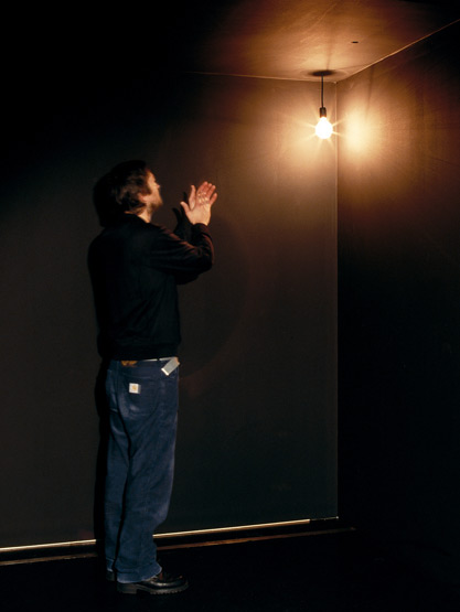
This piece Yoko Ono did with Fluxus relates very directly to mine because we use the same medium (video) to look at the striking and burning of a match. I would say that Yoko Ono's piece is far more minimalistic in its exploration while mine takes on a spatial component and the surrounding darkness, which I personally think is an important part of the human component tied to matches.


2. Yaacov Agam-Fiat Lux, 1967

Yaccov Agam likes to work with motion, sound and light. This piece is a lightbulb that turns on because of sound. I feel like the setting and singular light source relates to my piece. Matches produce a sound when lit and Agam is associating light with a sound as well as a space. I found this piece in the Light Art from Artificial Light book I checked out from the Dude.


3. Seth Riskin-Light Dances

Seth Riskin uses dance and light to show space in his works. His work is as much about the darkness as it is about the light source and human interaction. I am actually really excited that I discovered him because his artist statement (quoted below) reveals that we think in similar ways about light and space and movement.


"My first impulse as an artist was to become space. I wanted to bring viewers inside the movement experience, into contact with the numinous dimensions of space. Light allows me to realize this artistic vision.

In the Light Dance performances, light carries the subjective experience of movement beyond the limits of my body. Light Dance is a transposition of the “dance” from the body to the boundaries of the room. In silent, space-defining performances, light effects extend from my body. I “sculpt” space; precise body movements articulate fluid architectures of light, encompassing viewers with the “dance”.

Fundamental tenets of the Light Dance thesis include the concept that inner light and physical light are one, and that an experience of light can overcome the experience of body.

The silence of Light Dance I experience as wholeness. Inspired by a sense of the unlimited, I was led to light as a metaphor for deep knowing, dissolving borders between the body and space, the human spirit and material, the performer and viewer. I understand silence as I do darkness: not void, but whole, the fullest knowing of light, rather than its absence, that may be infinitely articulated and approached through art."


4. Plato's Allegory of the Cave

In his allegory Plato describes people chained to the wall in a cave. Behind them a fire burns and there are puppeteers making shadows. The people fear the shadows because they don't see what causes them. This is all they know of as reality.

I think this relates to my piece because the only light comes from the matches, which create shadows and reveal the world to the performer and audience at the same time. The performer and the camera become puppeteers, deciding what the viewer gets to see within the space at any given moment. Video uses a singular perspective, creating the only reality of my basement that the audience can know.


5. 15th Century Projector-Johannes de Fontana

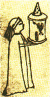
The projector was initially invented in 1420 by Johannes de Fontana. He drew a picture (seen below) of a monk holding a lantern with a translucent window containing the image of a devil. Most of the initial projections were frightening and related to hell. I think the darkness and flickering shadows of candles and match light can take on that ambiance and they project shadows into a space, even if they are soft and out of focus (which is what Fontana's image would have looked like since his projector didn't have a lens).